

AI Adoption
Vendor ROI
The Vendor ROI report measures the return on investment of your AI tools by tracking adoption, active usage, and productivity impact across teams. It is accessible from the AI section in the left sidebar and is organized into tabs for each connected AI provider, plus an Overview tab.
Overview tab
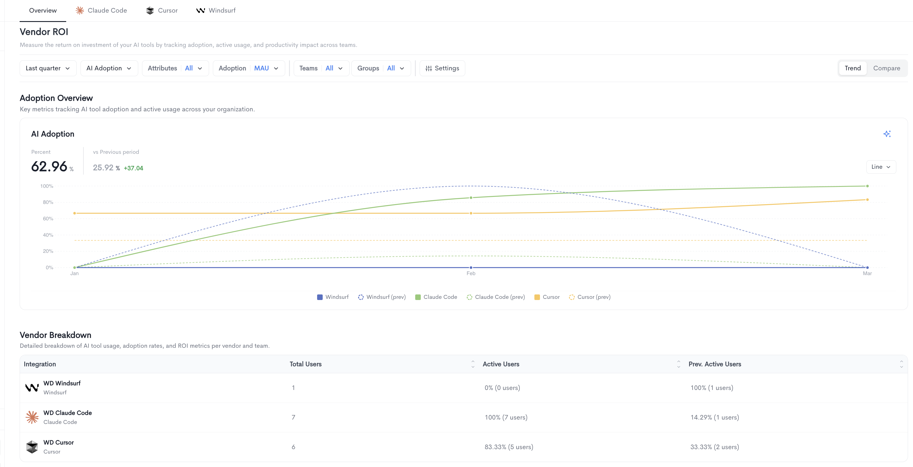
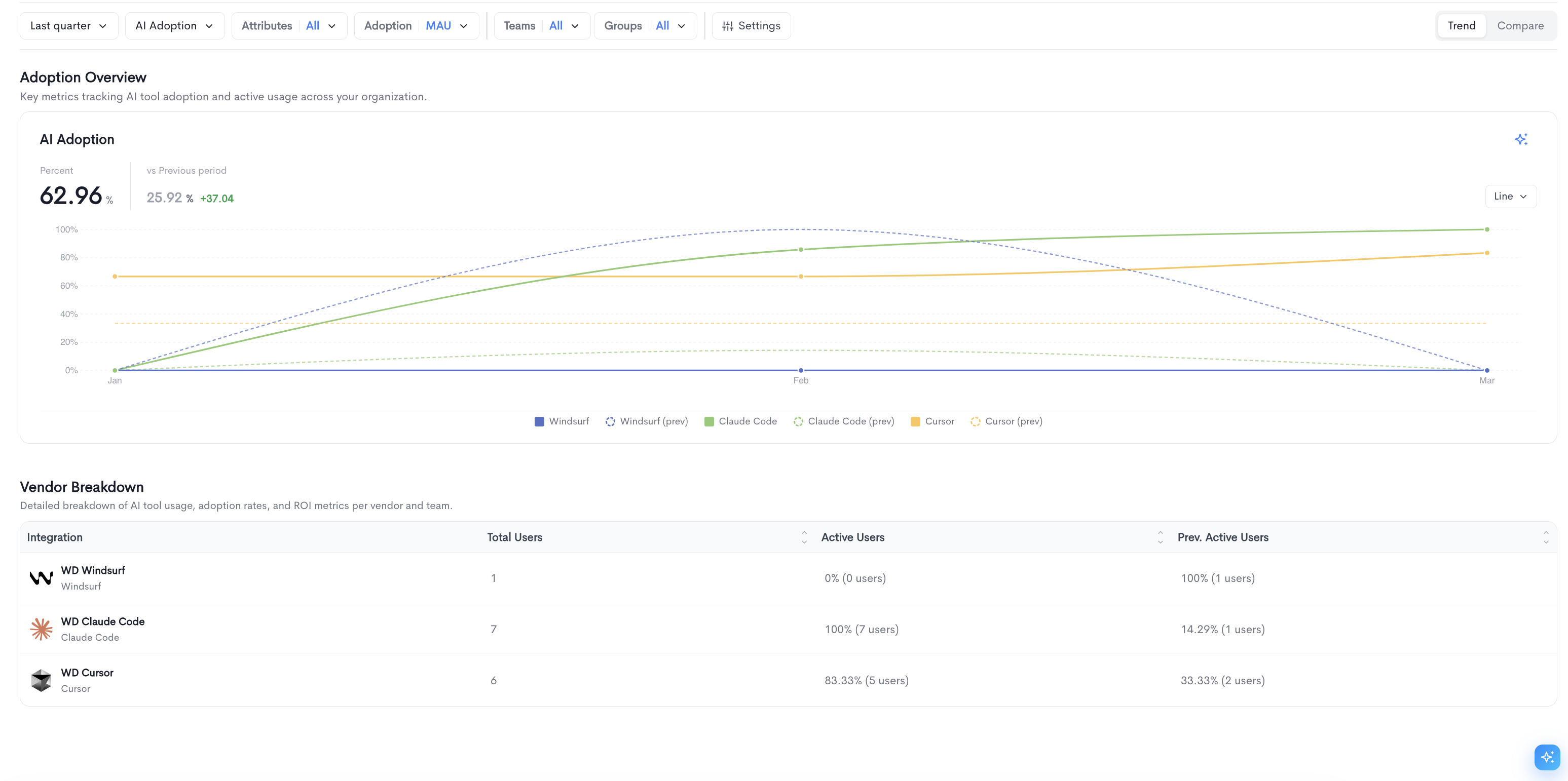
The Overview tab provides a cross-vendor summary of AI tool adoption and usage. It contains two main sections:
Adoption Overview — A time-series chart tracking AI tool adoption across all connected vendors over the selected period. The chart displays each vendor's adoption rate alongside its previous period for comparison. The chart can be toggled between Line and Bar views using the control in the top-right corner of the chart.
Vendor Breakdown — A detailed table showing usage, adoption rates, and ROI metrics per vendor, with the following columns:
-
Integration — The name of the connected AI provider.
-
Total Users — The total number of users synced from the provider.
-
Active Users — The percentage and count of users active in the current period.
-
Prev. Active Users — The percentage and count of users active in the previous period for comparison.
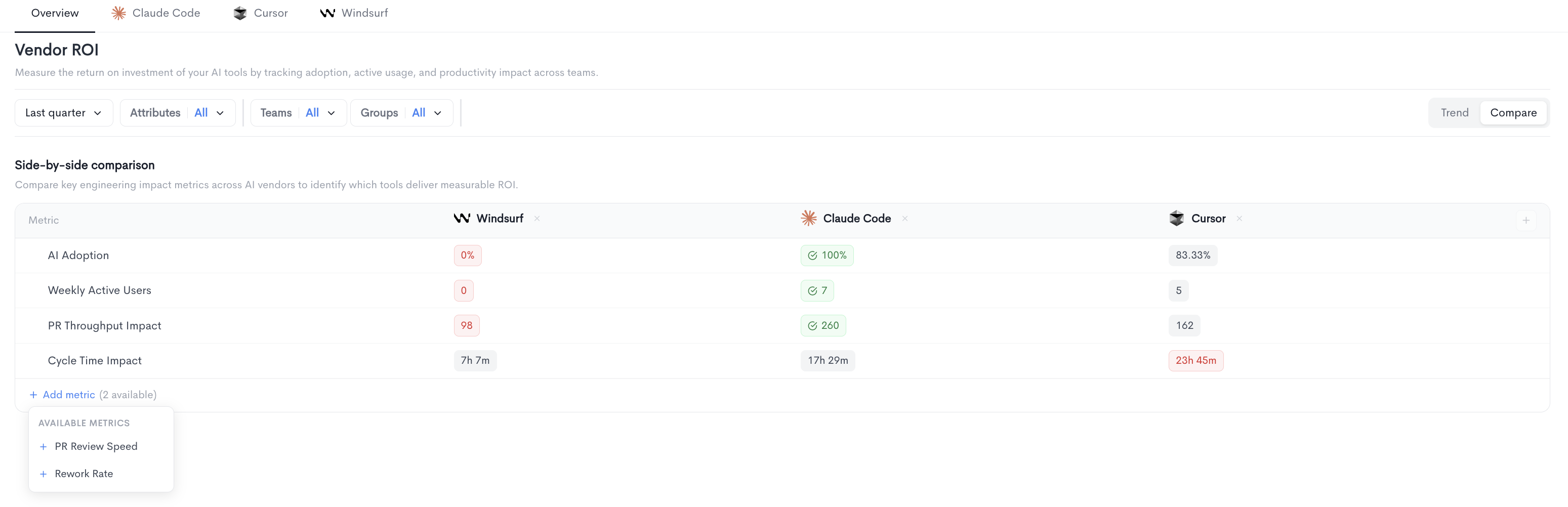
 Compare view
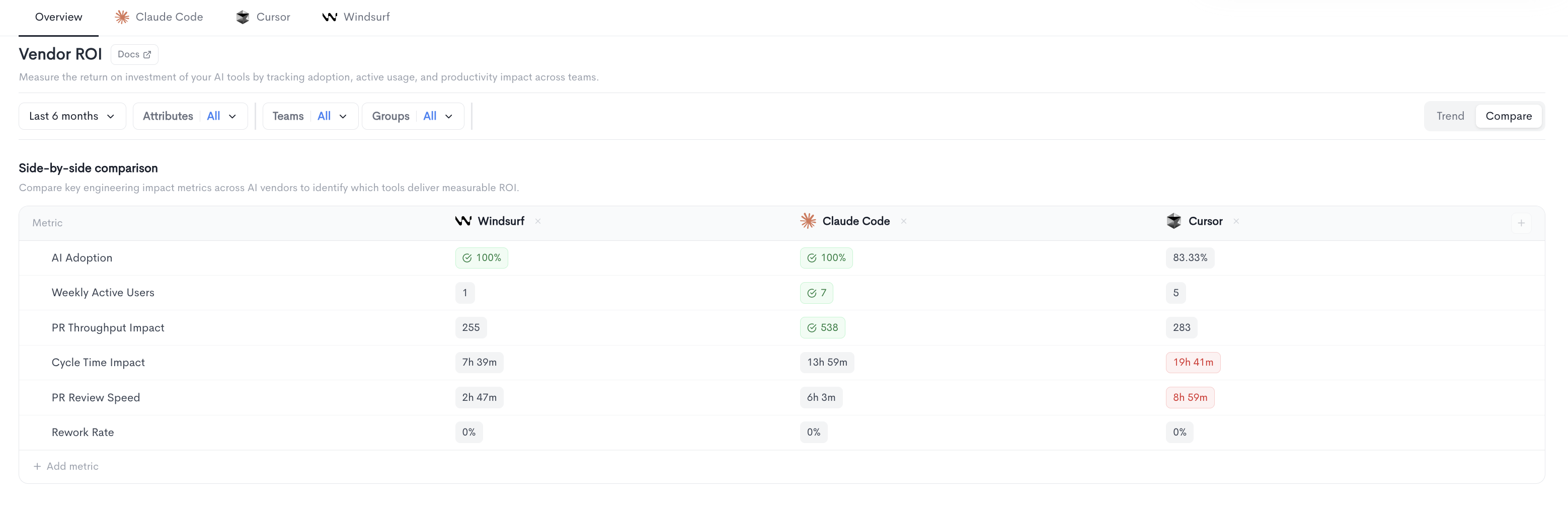
The Compare view in the Vendor ROI report displays a side-by-side comparison table of key engineering impact metrics across all connected AI vendors. It helps you identify which tools deliver measurable ROI.
Each column represents an AI vendor (e.g. Windsurf, Claude Code, Cursor) and each row represents a metric. Values are color-coded to highlight the best and worst performing vendors at a glance. Additional vendors can be added to the comparison using the + button at the end of the column headers.
The following metrics are displayed by default:
-
AI Adoption - The percentage of users actively using the AI tool.
-
Weekly Active Users - The number of users active at least once per week.
-
PR Throughput Impact - The impact of AI tool usage on pull request throughput.
-
Cycle Time Impact - The impact of AI tool usage on cycle time.
-
PR Review Speed - The impact of AI tool usage on pull request review speed.
-
Rework Rate - The percentage of AI-assisted code that was subsequently reworked.
-
Filters
The following filters are available at the top of the Vendor ROI report:
- Date range — Select the time period for the report (e.g. Last quarter).
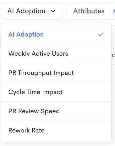
- AI Adoption — Select which metric to display in the chart. Available options are:
- AI Adoption — Percentage of users actively using the AI tool.
- Weekly Active Users — Users active at least once per week.
- PR Throughput Impact — Impact on pull request throughput.
- Cycle Time Impact — Impact on cycle time.
- PR Review Speed — Impact on pull request review speed.
- Rework Rate — Impact on rework rate.
- Attributes — Filter by user attributes (e.g. AI assistant usage, QA, Seniority). Multiple attribute values can be selected.
- Adoption — Select the active user frequency threshold:
- DAU — Daily active users, active at least once per day.
- WAU — Weekly active users, active at least once per week.
- MAU — Monthly active users, active at least once per month.
- Teams — Filter results by one or more teams.
- Groups — Filter results by one or more groups.
- Settings — Toggle on comparison with "Previous period" .
Trend and Compare views
The report can be toggled between two views using the buttons in the top-right corner:
-
Trend — Displays adoption and usage metrics over time in a chart format, alongside a vendor breakdown table.
-
Compare — Displays a side-by-side comparison table of key engineering impact metrics across all connected AI vendors. Metrics shown include AI Adoption, Weekly Active Users, PR Throughput Impact, and Cycle Time Impact. Additional metrics such as PR Review Speed and Rework Rate can be added using the + Add metric button.
Vendor tabs
Each connected AI provider has its own dedicated tab (Claude Code, Cursor, Windsurf, etc.) with two sub-tabs:
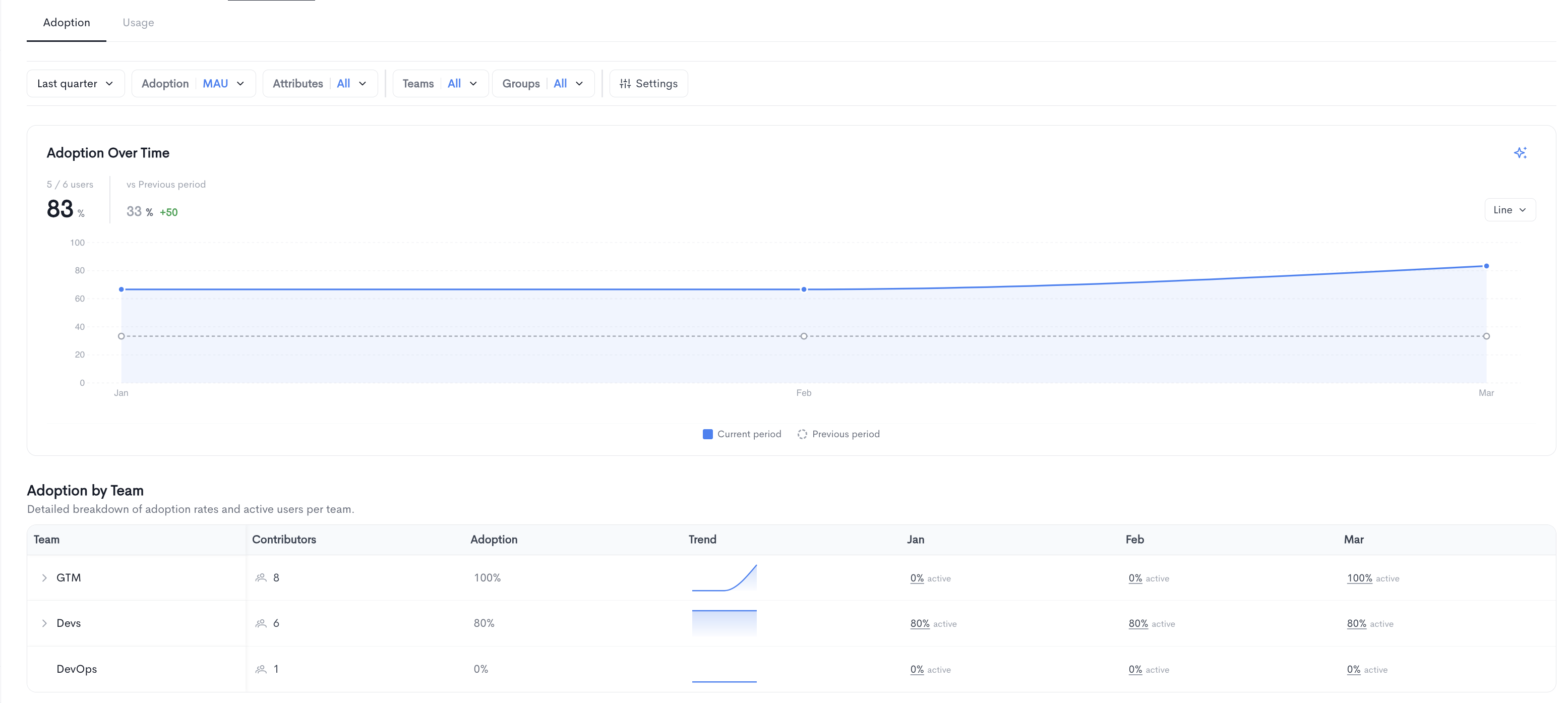
Adoption
Shows adoption over time for the selected vendor, including:
-
A time-series chart comparing the current period to the previous period.
-
An Adoption by Team table breaking down adoption rates and active users per team, with monthly columns showing the active percentage for each period. Teams can be expanded to reveal sub-teams.
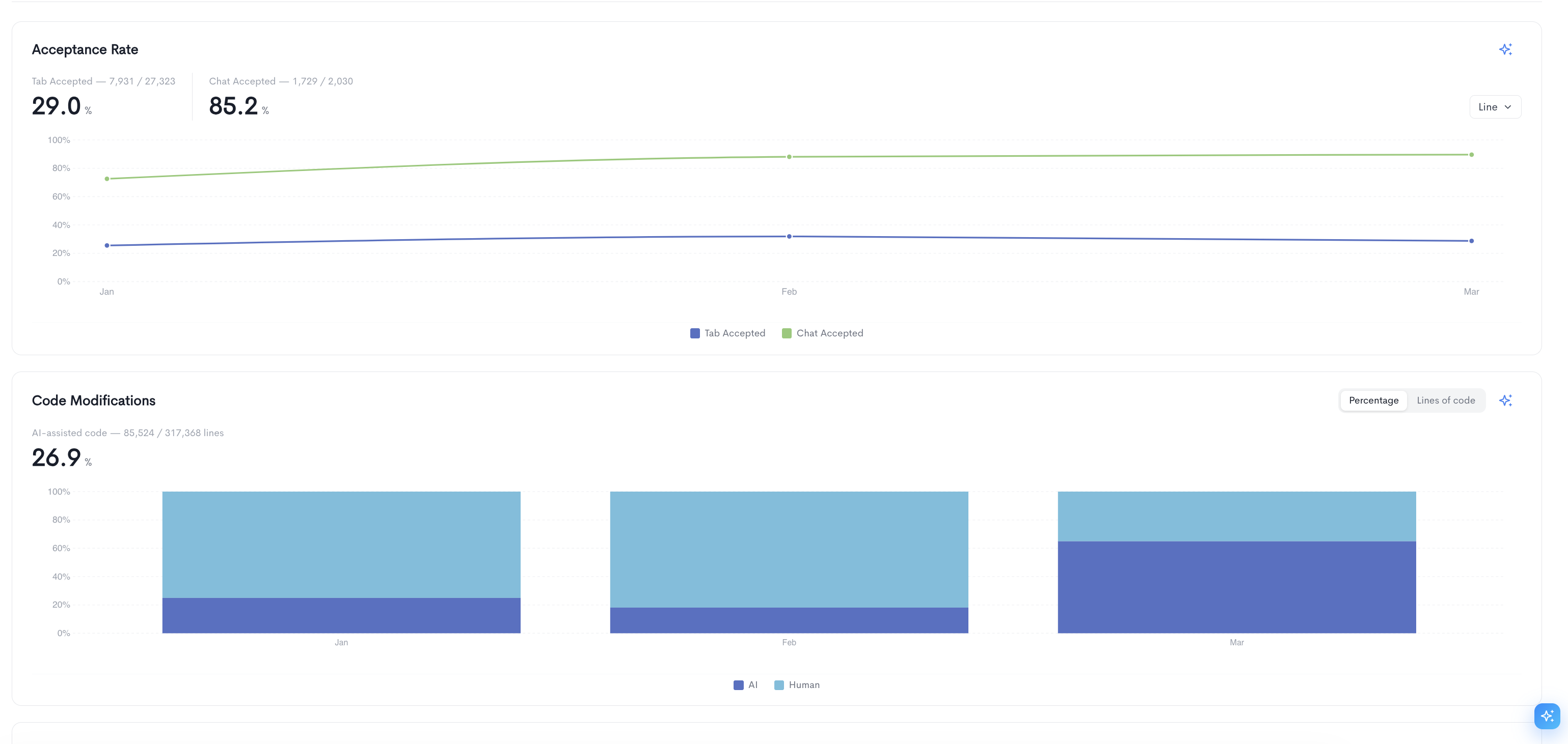
Usage
The Usage tab provides detailed metrics on how your team is interacting with the AI tool. It contains the following sections:
Acceptance Rate — Tracks the rate at which AI suggestions are accepted by users over time, broken down into two metrics:
- Tab Accepted — The percentage of tab completion suggestions accepted by users.
- Chat Accepted — The percentage of chat responses accepted by users.
The chart can be toggled between Line and Bar views.
Code Modifications — Shows the proportion of AI-assisted code versus human-written code over time, displayed as a stacked bar chart. The overall percentage of AI-assisted lines is shown at the top. The chart can be toggled between Percentage and Lines of code views.
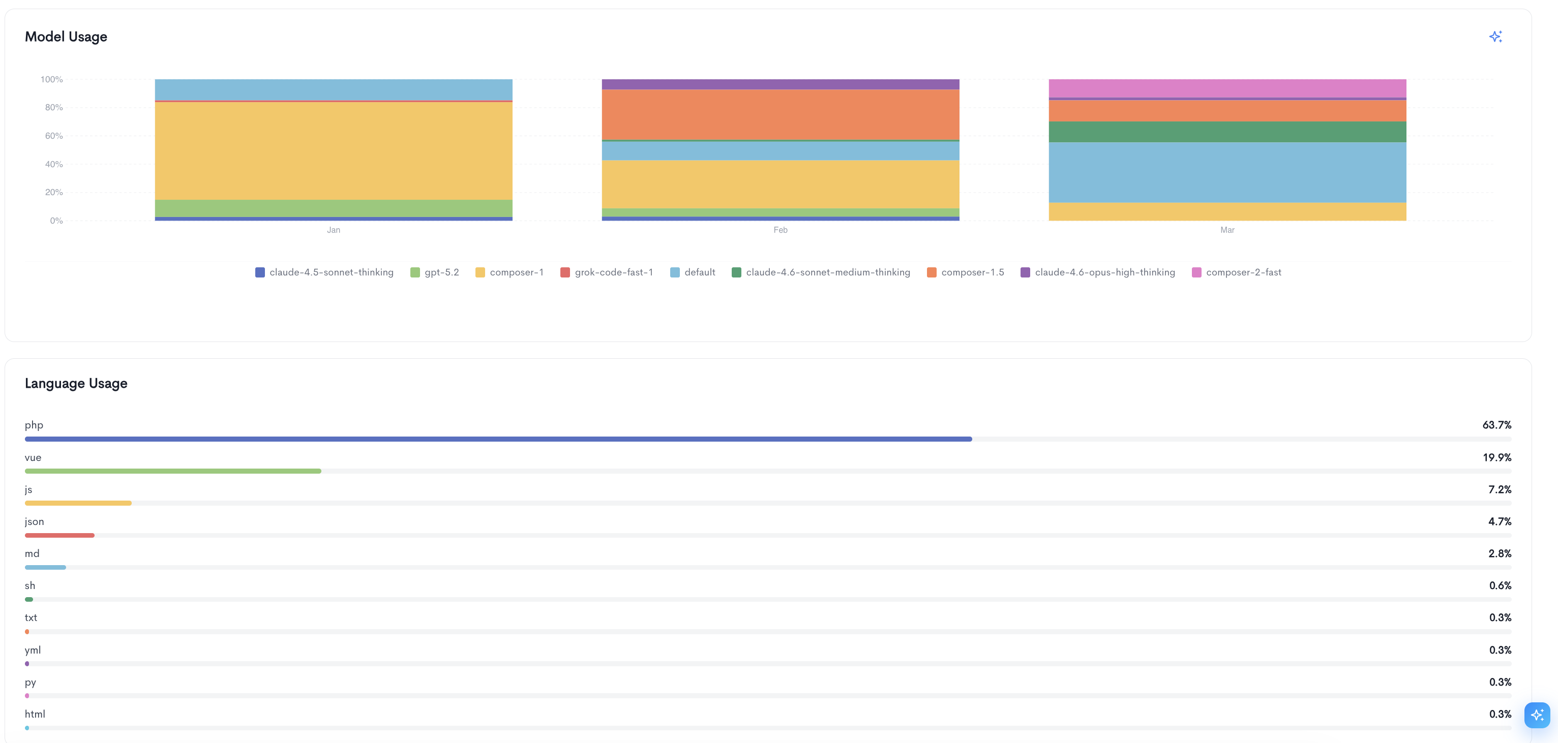
Model Usage — A stacked bar chart showing the distribution of AI models used by your team over time (e.g. claude-4.5-sonnet-thinking, gpt-5.2, composer-1, grok-code-fast-1). This helps identify which models are most frequently used across the selected period.
Language Usage — A ranked list of programming languages used in AI-assisted code, with each language shown as a horizontal bar and its percentage of total usage displayed on the right.
Updated 3 months ago