

Team Insights
Team Insights provides a summary of each team's recent activity, bringing delivery metrics, issue workload, individual contribution, and benchmarked performance into a single view per team.
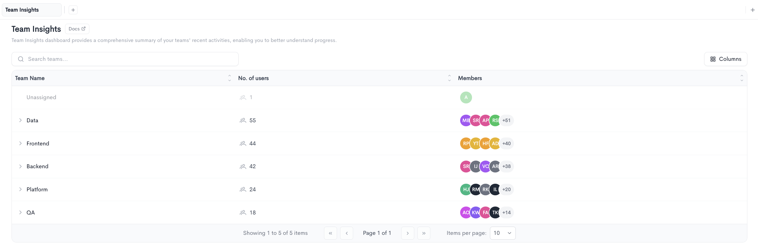
The landing page lists every team in your workspace. Use the Search teams... field to filter the list by name, and click Columns to choose which columns are displayed.
The team table contains the following columns:
- Team Name - The name of the team. Teams with sub-teams show a chevron that expands to reveal them.
- No. of users - The number of users assigned to the team.
- Members - Avatars of the team members, with a
+Nindicator when the team has more members than can be displayed.
Users who do not belong to any team are grouped under an Unassigned row at the top of the list. This row is displayed separately and is not included in the item count shown in the pagination footer.
Click a team name to open its detail view.
Team detail
The team detail view is scoped by two controls at the top of the page, both of which apply to every tab:
- Date range - The reporting period. All metrics, charts, and comparisons are calculated over this range.
- Settings - Opens a panel controlling how metrics are aggregated and displayed.
The Settings panel contains the following fields:
- Granularity - The time bucket used for charts and trend lines, for example
Months. - Calculation - The aggregation method applied to time-based metrics. Options are
Mean,Median,P75, andP90.
The team name, icon, and member avatars are shown below the controls, followed by four tabs: Snapshot, Workload, Work-Log, and Performance.
Snapshot tab
The Snapshot tab gives an at-a-glance view of the team's delivery performance over the selected date range.
Cycle Time Breakdown
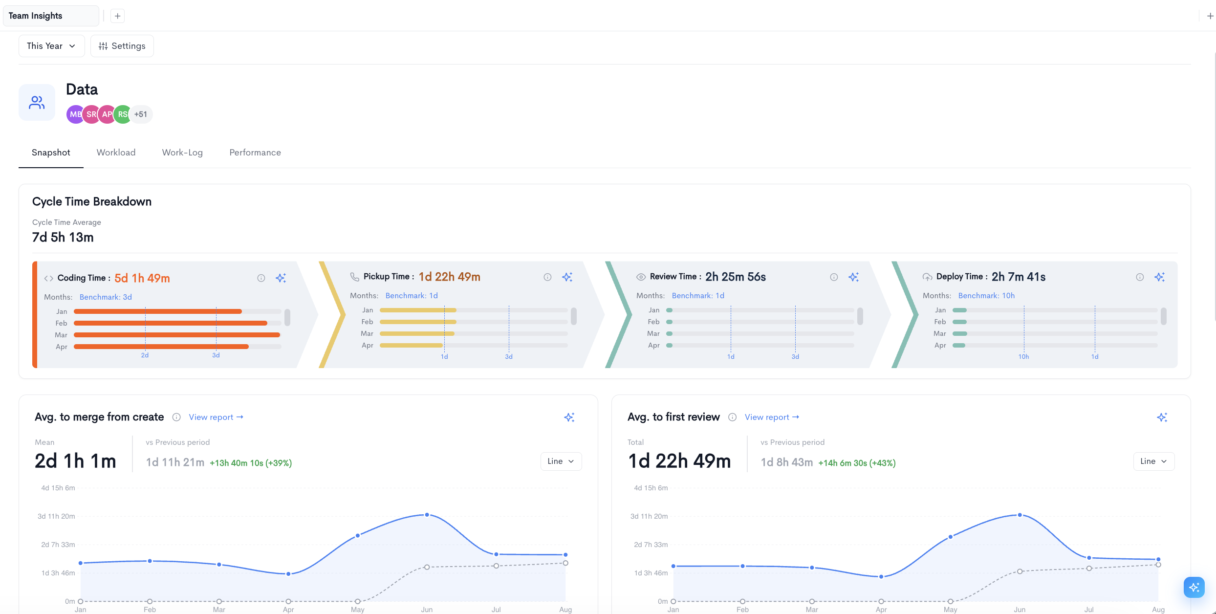
The Cycle Time Breakdown card splits the team's average cycle time into its four sequential stages. The Cycle Time Average is displayed at the top, followed by the stages:
- Coding Time - Time from first commit to pull request creation.
- Pickup Time - Time from pull request creation to the first review.
- Review Time - Time from first review to merge.
- Deploy Time - Time from merge to deployment.
Each stage shows its average duration for the period and a Benchmark value it is measured against. Below the benchmark, a small bar chart shows the stage duration for each bucket in the selected granularity, so you can see which periods drove the average. Bars are colored according to their position relative to the benchmark, and a stage exceeding its benchmark is highlighted to draw attention to it.
Each stage has an information icon explaining the calculation and an AI icon that generates an explanation of the result.
Metric charts
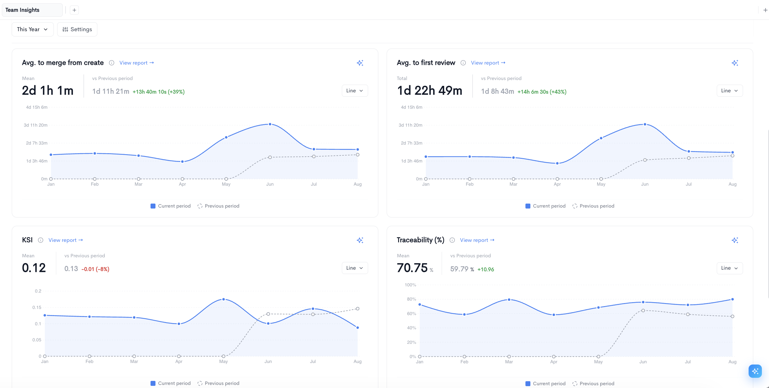
Below the cycle time breakdown, a set of metric chart covers headline delivery and health measures for the team. Each chart shows:
- Value - The aggregated value for the selected date range, labelled with the aggregation applied.
- vs Previous period - The equivalent value for the preceding period of the same length, followed by the absolute and percentage change. Improvements are shown in green and regressions in red, with the direction depending on whether higher or lower is better for that metric.
- Chart type - A dropdown controlling how the chart renders, for example
Line.
Each chart plots the Current period as a solid line and the Previous period as a dashed line, so the two can be compared directly across the same buckets.
Charts include an information icon describing the metric, a View report link that opens the full report for that metric, and an AI icon for a generated summary. Charts can be repositioned within the tab using the move handle that appears on hover.
Workload tab
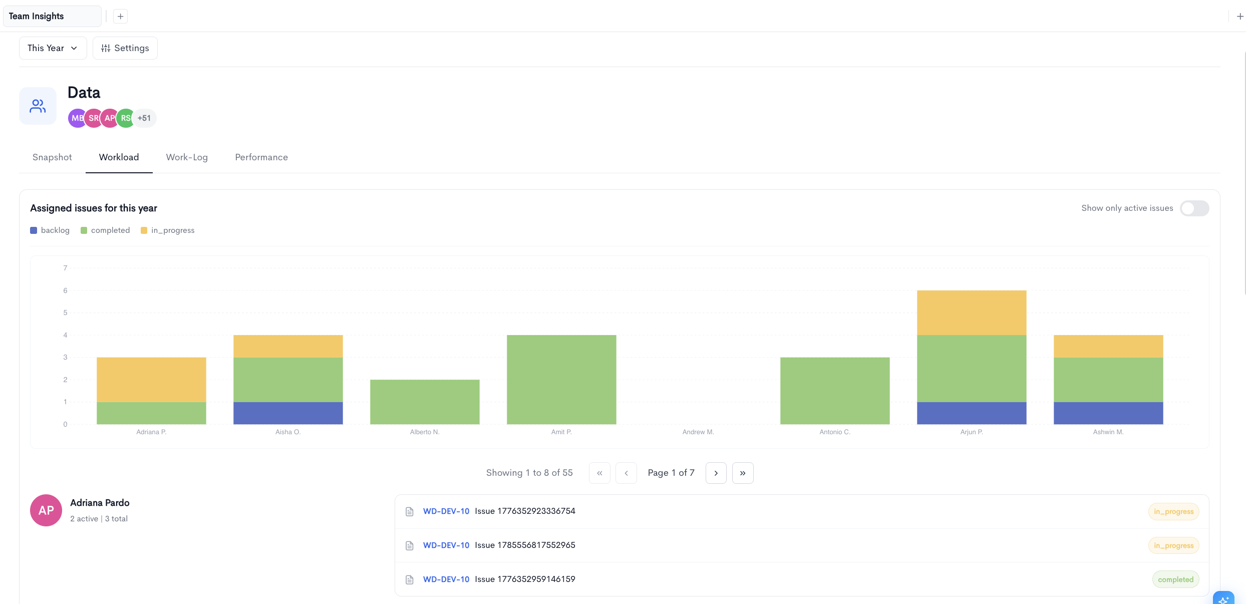
The Workload tab shows how issues are distributed across the team for the selected date range.
The Show only active issues toggle filters the view to issues that are not yet complete.
A stacked bar chart displays one bar per team member, segmented by issue status. The legend above the chart lists every status present in the data, with each status taking its color from your issue tracker configuration.
Below the chart, each team member is listed with:
- Member - The person's avatar and name.
- Issue counts - The number of active issues and the total number of issues assigned in the period, shown as
0 active | 23 total. - Issues - A list of that member's issues, each showing the issue key, summary, and current status. Click the issue key to open it in your issue tracker.
Only the first few issues are listed per member. Click Show all to expand the full list. The member list is paginated using the controls above it.
Work-Log tab
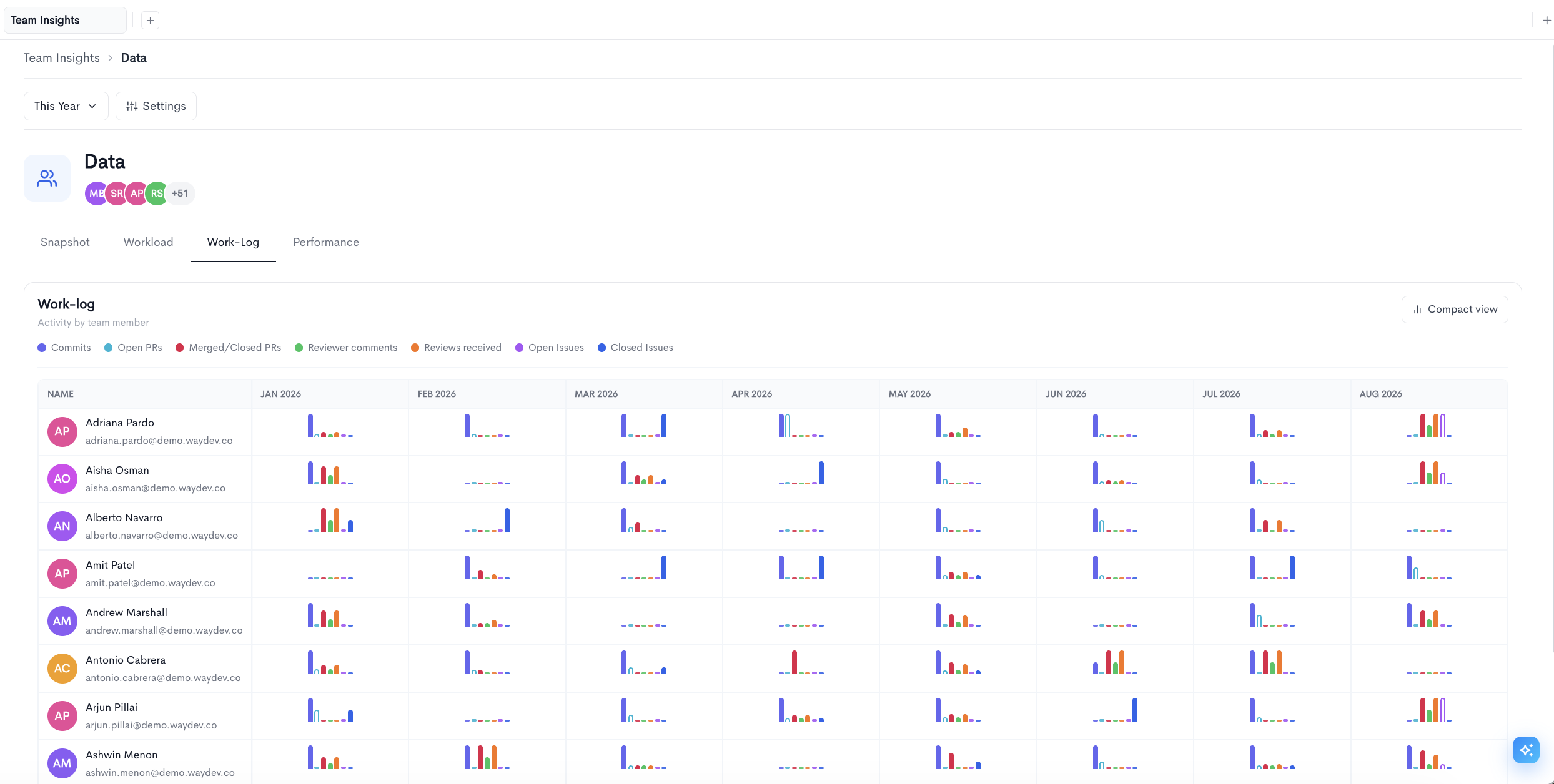
The Work-Log tab shows activity by team member across the selected date range, broken into buckets according to the configured granularity.
The table lists one row per member and one column per time bucket. Each cell contains a grouped bar chart covering the following activity types:
- Commits - Commits authored in that period.
- Open PRs - Pull requests opened.
- Merged/Closed PRs - Pull requests merged or closed.
- Reviewer comments - Review comments left on other people's pull requests.
- Reviews received - Reviews received on their own pull requests.
- Open Issues - Issues opened.
- Closed Issues - Issues closed.
Click Compact view to switch to a denser layout. The table is paginated, and the number of rows per page can be adjusted using the Items per page control.
Performance tab
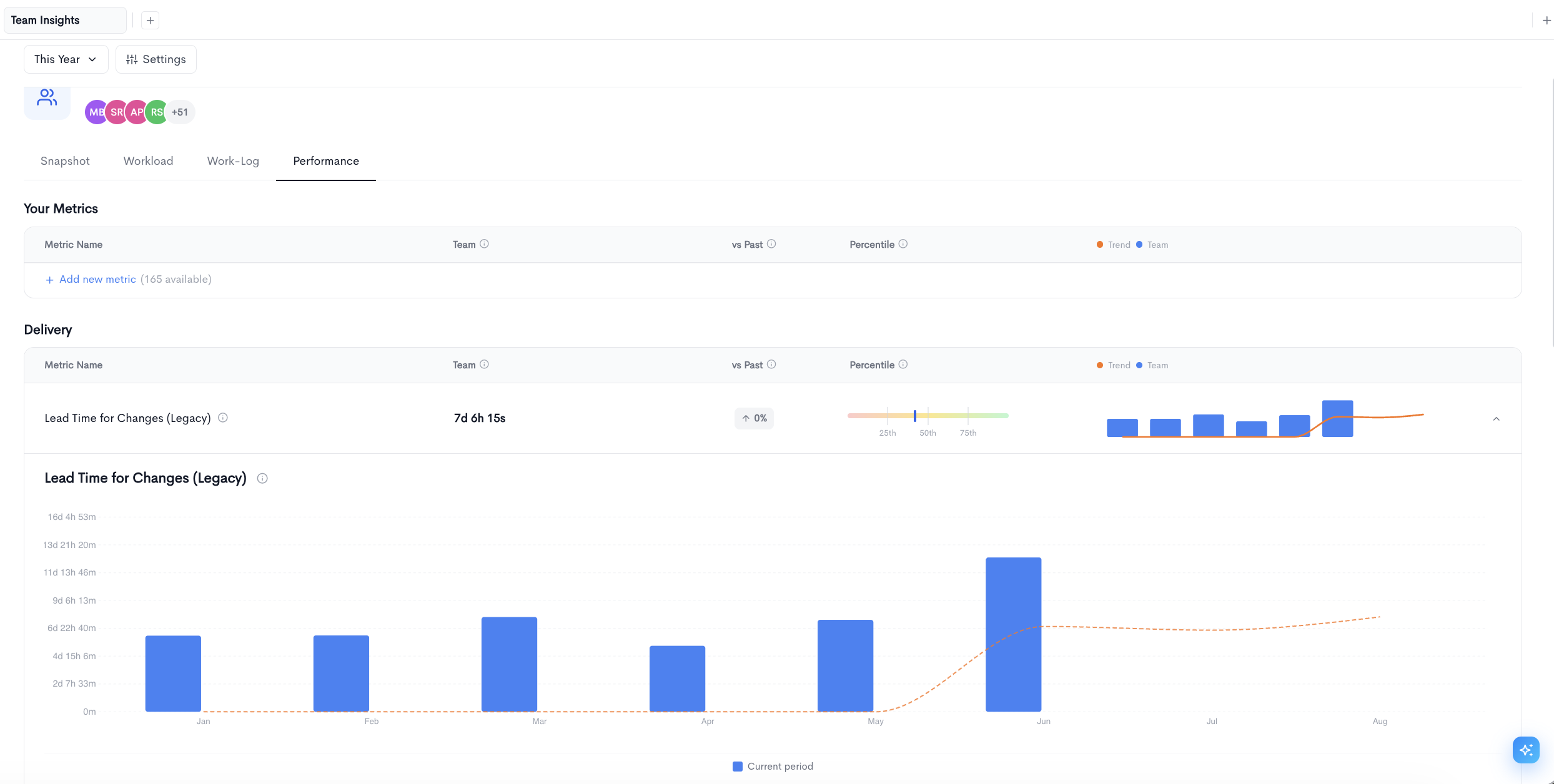
The Performance tab benchmarks the team against percentile bands across a broader set of metrics, grouped into sections such as Delivery and Health.
Each section presents a table with the following columns:
- Metric Name - The name of the metric, with an information icon describing how it is calculated.
- Team - The team's value for the selected date range. Metrics without data for the period display a dash.
- vs Past - The percentage change against the preceding period, with an arrow indicating direction. Coloring reflects whether the change is an improvement or a regression for that specific metric, so a decrease in a wait-time metric is shown in green while an increase in an unreviewed pull request metric is shown in red.
- Percentile - A gradient bar with markers at the
25th,50th, and75thpercentiles, and a tick showing where the team falls. This makes it possible to see whether a value is typical or an outlier without knowing the underlying distribution. - Trend and Team - A combined chart showing the team's value per bucket as bars and the trend as a line.
Click the chevron at the end of any row to expand that metric into a full-width chart for the selected period.
Your Metrics
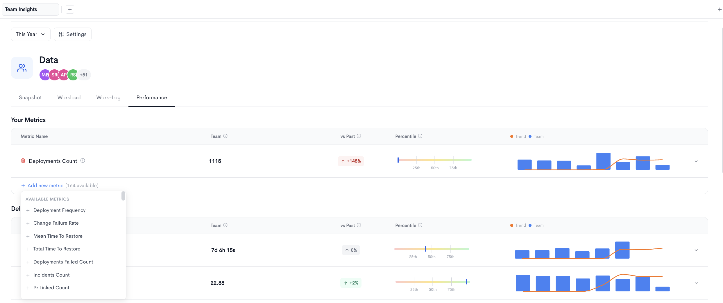
The Your Metrics section at the top of the tab lets you assemble a custom set of metrics to track for this team, so the measures that matter most appear above the standard groups.
Click Add new metric to open the list of available metrics. The link displays how many metrics are available to add, and the list can be scrolled and searched. Click the + beside any metric to add it to the section.
Updated 4 days ago