

Snapshots
Snapshots provide a point-in-time view of self-reported developer experience data collected through periodic surveys. Each snapshot combines driver scores, workflow measurements, time allocation, and qualitative comments, with results benchmarked against industry percentiles and broken down by team.
The snapshot date selector at the top left controls which survey round is displayed. Use the dropdown to switch between previous snapshots.
The following tabs are available:
- Drivers - Perception-based scores measuring how developers experience their environment, tooling, and processes.
- Workflows - Quantitative, self-reported measurements of time spent or frequency across common engineering activities.
- Heatmap - A team-by-metric grid showing where scores diverge from the selected benchmark.
- Allocation - How respondents report splitting their time across work categories.
Two controls are available on every tab:
- Compare to - Selects the benchmark all deltas are measured against. Options include
Industry P50,Industry P75andIndustry P90. - Teams - Filters results to a specific team or the full organization. Defaults to
All.
Drivers tab
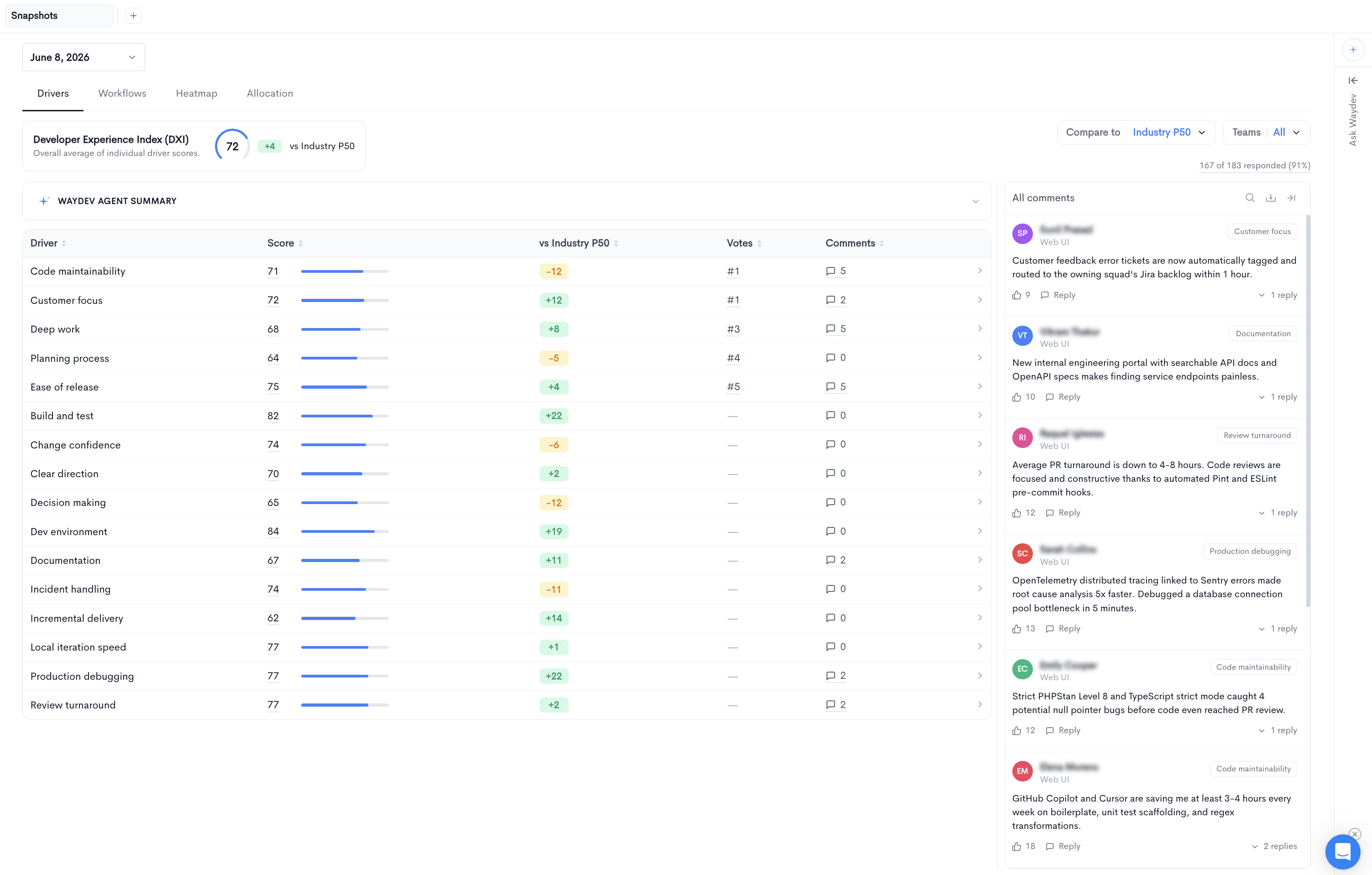
The Drivers tab lists every driver measured in the snapshot alongside its score and benchmark comparison.
At the top of the tab, the Developer Experience Index (DXI) card shows the overall average of individual driver scores, along with its delta against the selected benchmark. Click the card to open the full DXI view.
The response rate is displayed on the right, showing the number of completed responses out of the total invited and the corresponding percentage.
The driver table contains the following columns:
- Driver - The name of the driver being measured.
- Score - The driver score from
0to100, shown with a progress bar. - vs Industry - The difference between the driver score and the selected benchmark. Positive values are shown in green, negative values in amber.
- Votes - The driver's rank by the number of respondents who selected it as an area they would like improved. Lower numbers indicate more votes.
- Comments - The number of comments associated with this driver.
Click any row to open the driver details panel.
All comments panel
The panel on the right side of the Drivers tab aggregates every comment left in the snapshot. Each comment shows the author, their team, and the driver the comment is tagged against.
The following actions are available at the top of the panel:
- Search - Filters comments by keyword.
- Export - Downloads the comments as a file.
- Expand - Opens the comments in a full-width view.
Each comment supports likes and threaded replies. Click Reply to respond, or click the reply count to expand the thread.
Driver details
Clicking a driver opens a detail panel with the following tabs.
Overview
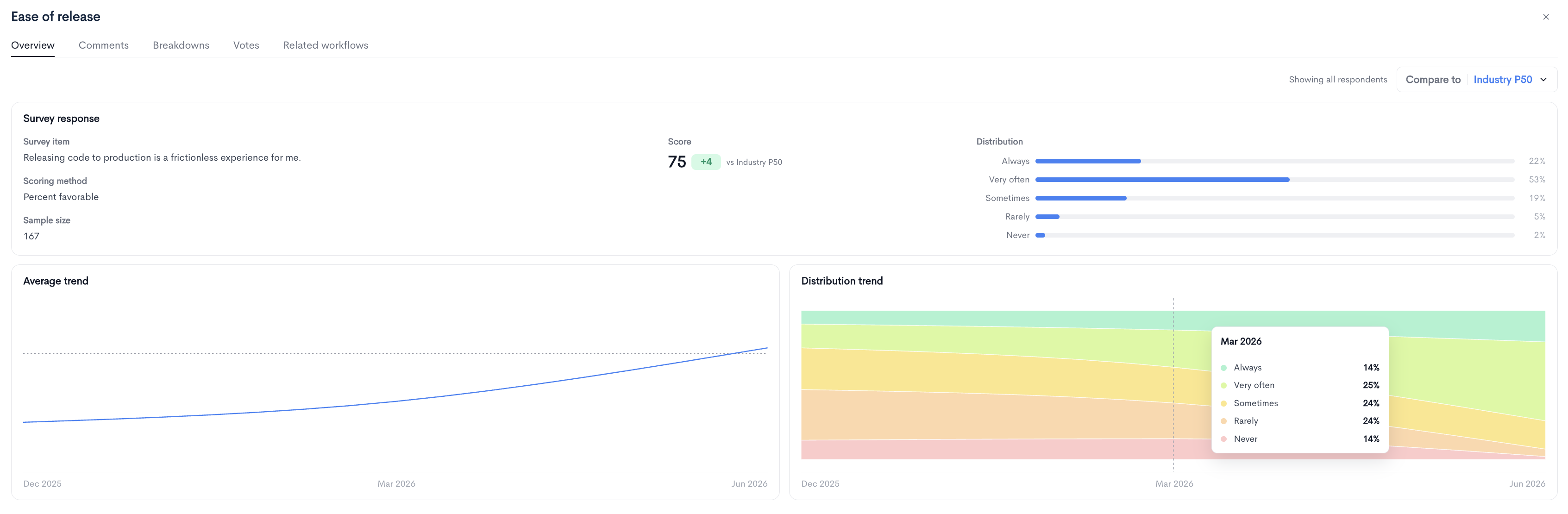
The Survey response section shows how the driver was measured:
- Survey item - The exact question presented to respondents.
- Scoring method - The method used to convert responses into a score, for example
Percent favorable. - Sample size - The number of responses the score is based on.
- Score - The driver score, with its delta against the selected benchmark.
- Distribution - The percentage and count of responses for each answer option, from
AlwaysthroughNever.
Two charts are displayed below:
-
Average trend - The driver score over time across previous snapshots.
-
Distribution trend - How the response distribution has shifted over time, shown as a stacked area chart. Hover over any point to see the exact percentage for each answer option at that date.
Comments
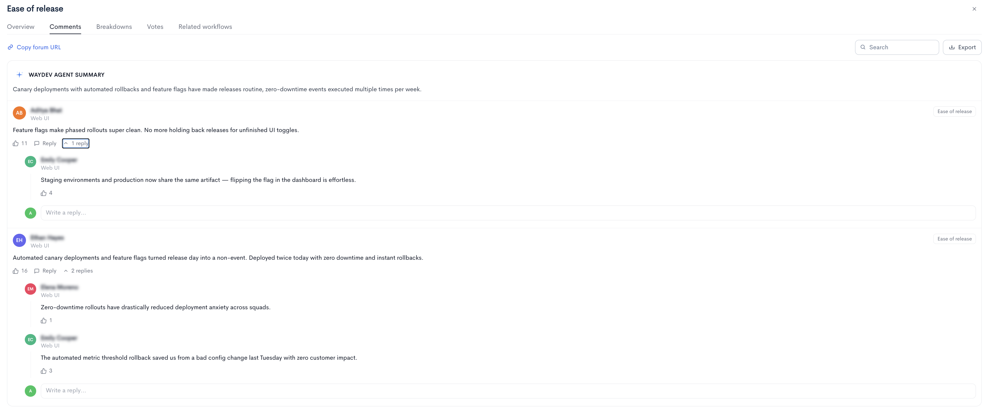
Lists all comments tagged to this driver, with the author, their team, like count, and reply thread. Search and Export are available at the top right.
Breakdowns
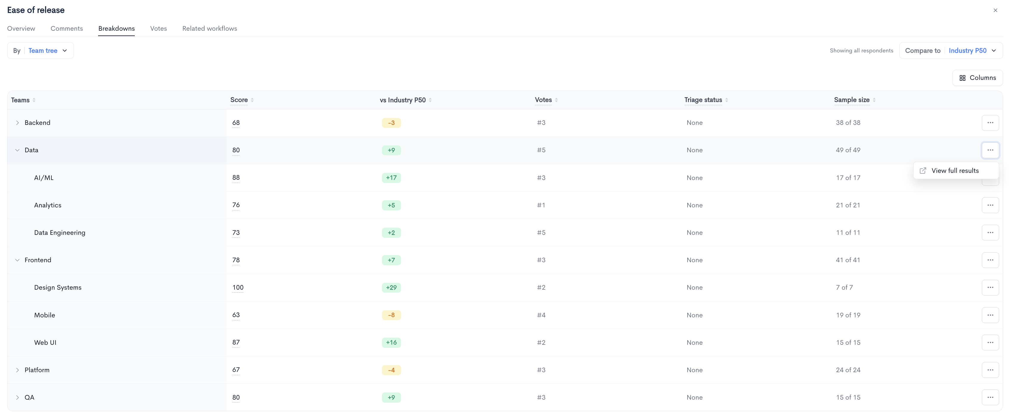
Shows the driver score segmented by team. Use the By dropdown to change the grouping dimension, for example Team tree. Click Columns to choose which columns are displayed.
The table contains the following columns:
- Teams - The team name. Parent teams can be expanded to show their child teams.
- Score - The driver score for that team.
- vs Industry - The team's delta against the selected benchmark.
- Votes - The driver's vote rank within that team.
- Triage status - The triage state assigned to this driver for the team. Defaults to
None. - Sample size - The number of responses received out of the number of people surveyed for that team.
Teams with no responses display a dash in place of a score.
Votes
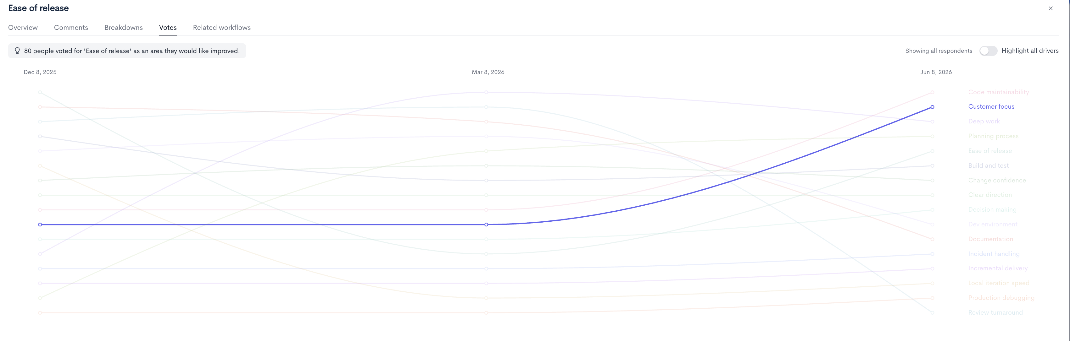
Shows how many respondents selected this driver as an area they would like improved, along with a bump chart tracking each driver's vote ranking across previous snapshots.
-
Highlight all drivers - When disabled, only the selected driver's line is highlighted and all others are faded. When enabled, every driver line is shown in full color.
Related workflows
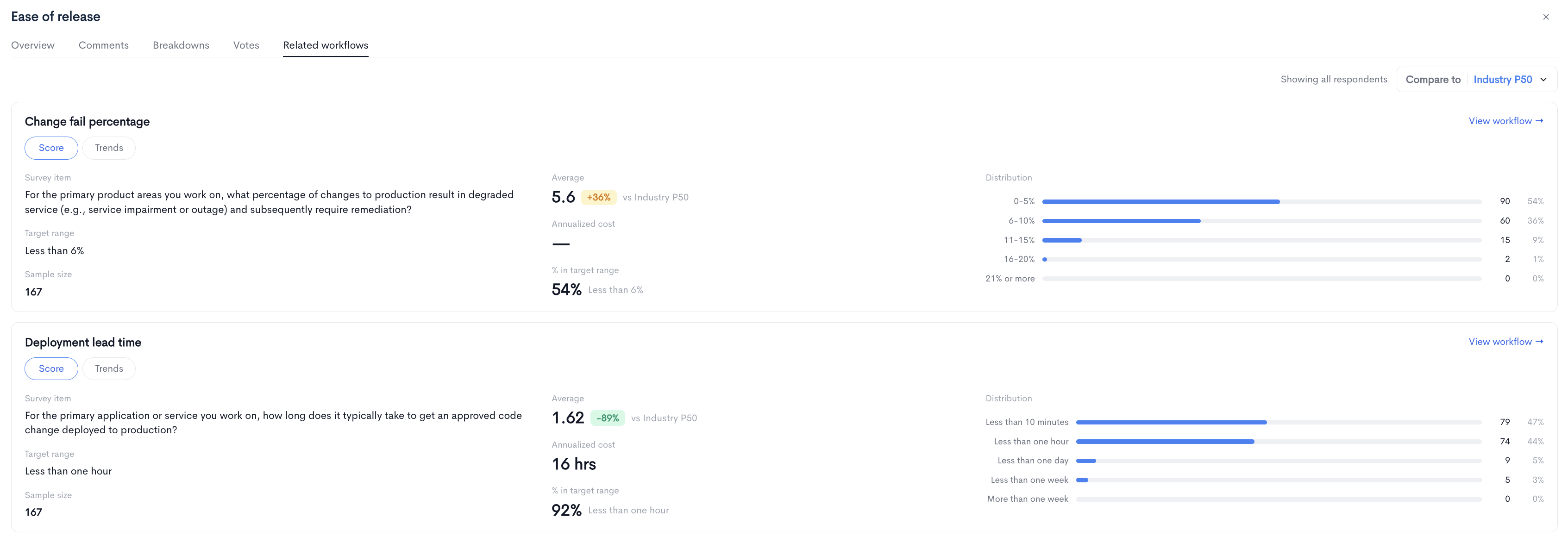
Displays the workflows connected to this driver. Each workflow card includes:
- Survey item - The question used to measure the workflow.
- Target range - The recommended target for this measurement.
- Sample size - The number of responses.
- Average - The average reported value, with its delta against the selected benchmark.
- Annualized cost - The estimated annual hours lost per engineer.
- % in target range - The share of respondents whose answers fall within the target range.
- Distribution - The count and percentage of responses in each answer bucket.
Use the Score and Trends toggle to switch between current values and historical charts. Click View workflow to open the full workflow details.
Workflows tab
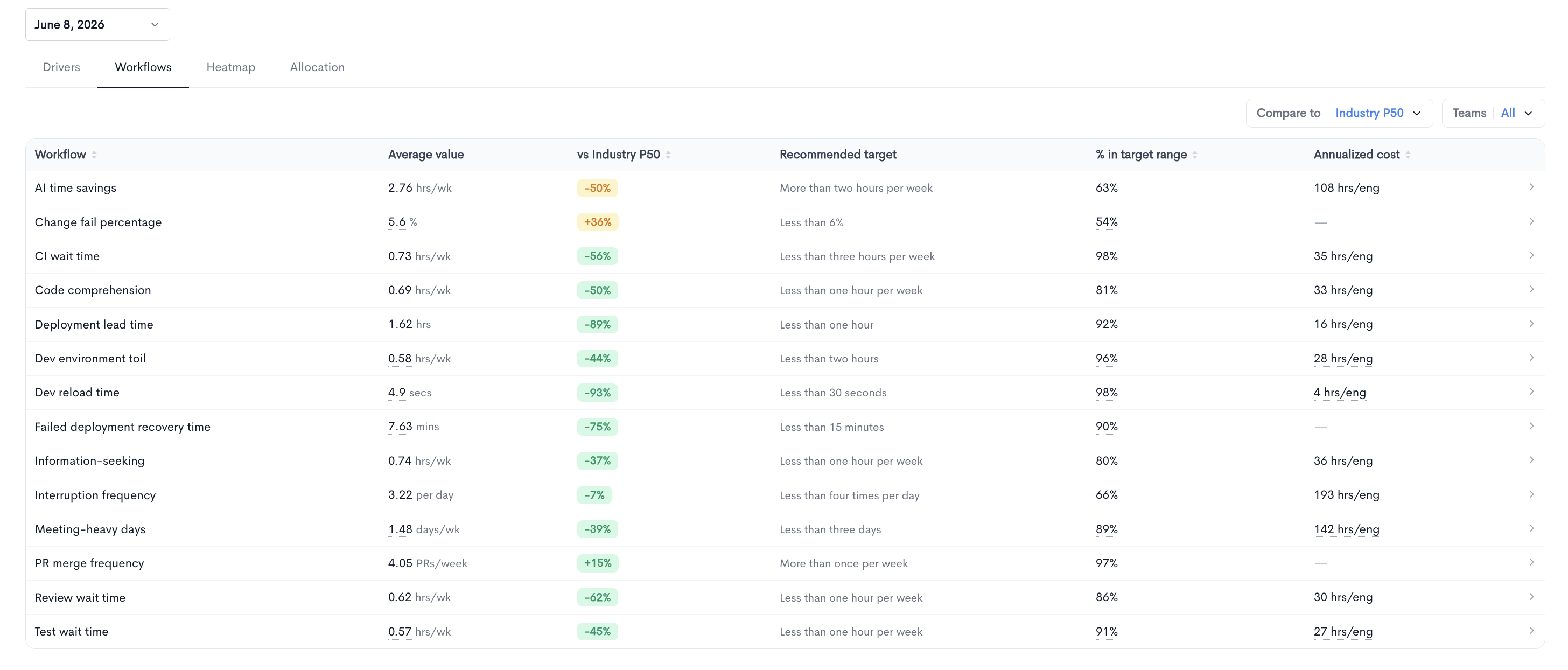
The Workflows tab lists quantitative measurements of engineering activities, each compared against a recommended target and the selected benchmark.
The table contains the following columns:
- Workflow - The name of the workflow being measured.
- Average value - The average reported value with its unit, for example
hrs/wk,secs,mins,per day,days/wk, orPRs/week. - vs Industry - The percentage difference from the selected benchmark. For workflows where lower is better, positive percentages indicate worse performance.
- Recommended target - The target range for this workflow, for example
Less than one hour per week. - % in target range - The share of respondents falling within the recommended target.
- Annualized cost - The estimated hours lost per engineer per year. Workflows without a cost model display a dash.
Click any row to open the workflow details panel.
Workflow details
Overview
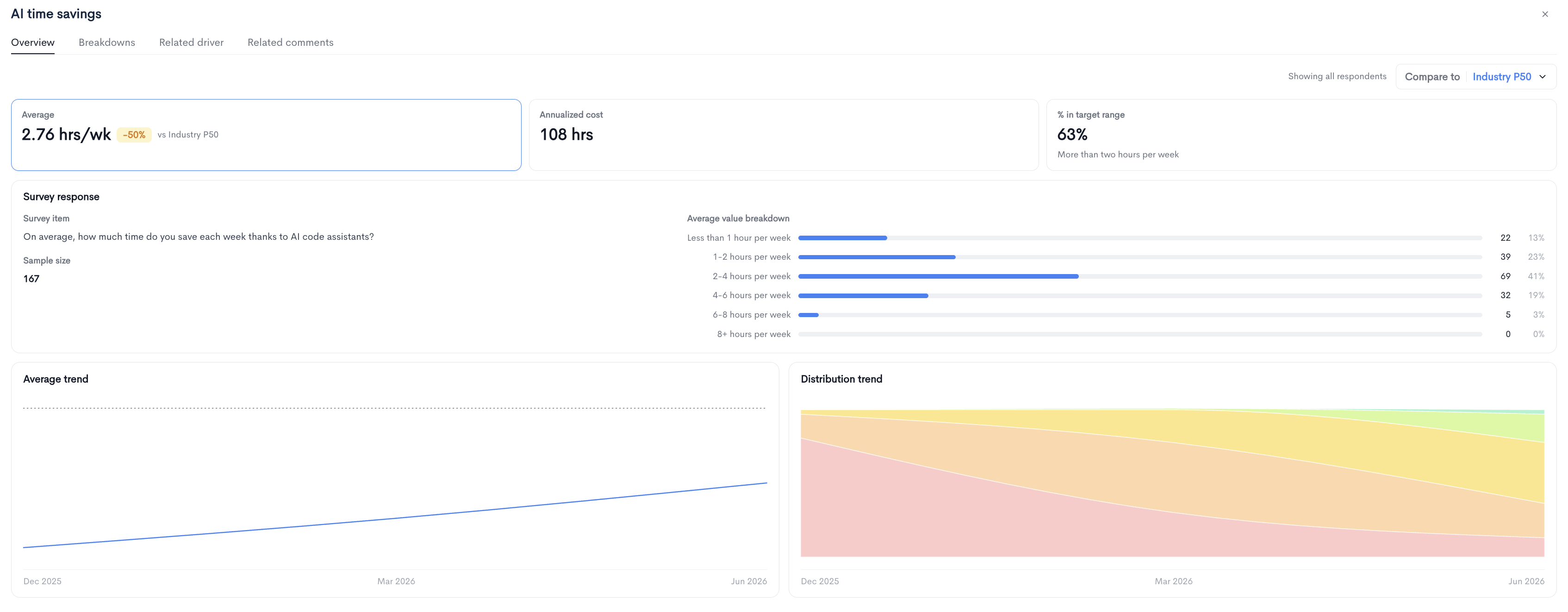
Three summary cards are shown at the top of the panel. Selecting a card changes the content displayed below it.
- Average - The average reported value and its delta against the selected benchmark.
- Annualized cost - The estimated hours lost per engineer per year.
- % in target range - The share of respondents within the recommended target.
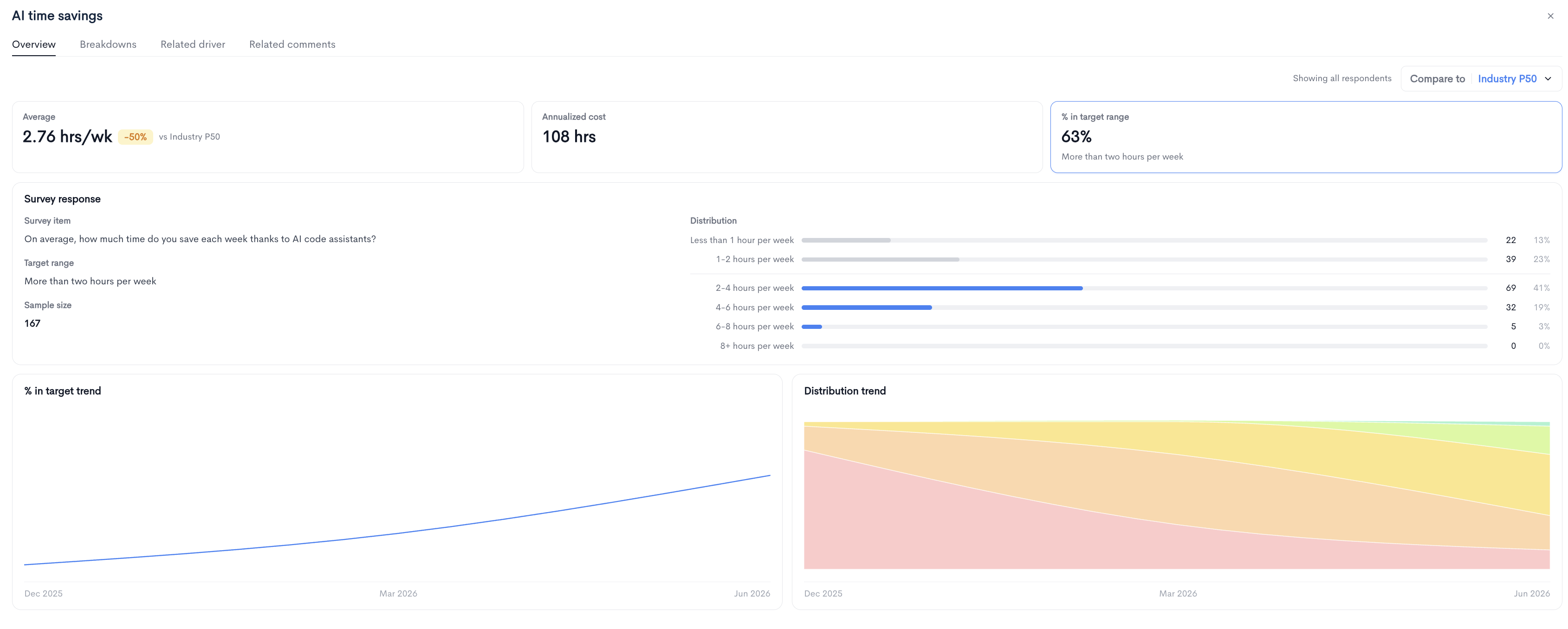
With Average selected, the Survey response section shows the survey item, sample size, and an average value breakdown listing the count and percentage of responses in each bucket. The Average trend and Distribution trend charts are shown below.
With % in target range selected, the survey response section additionally shows the Target range, and the distribution highlights in-range buckets in blue while greying out those that fall outside the target. The % in target trend and Distribution trend charts are shown below.
Annualized cost
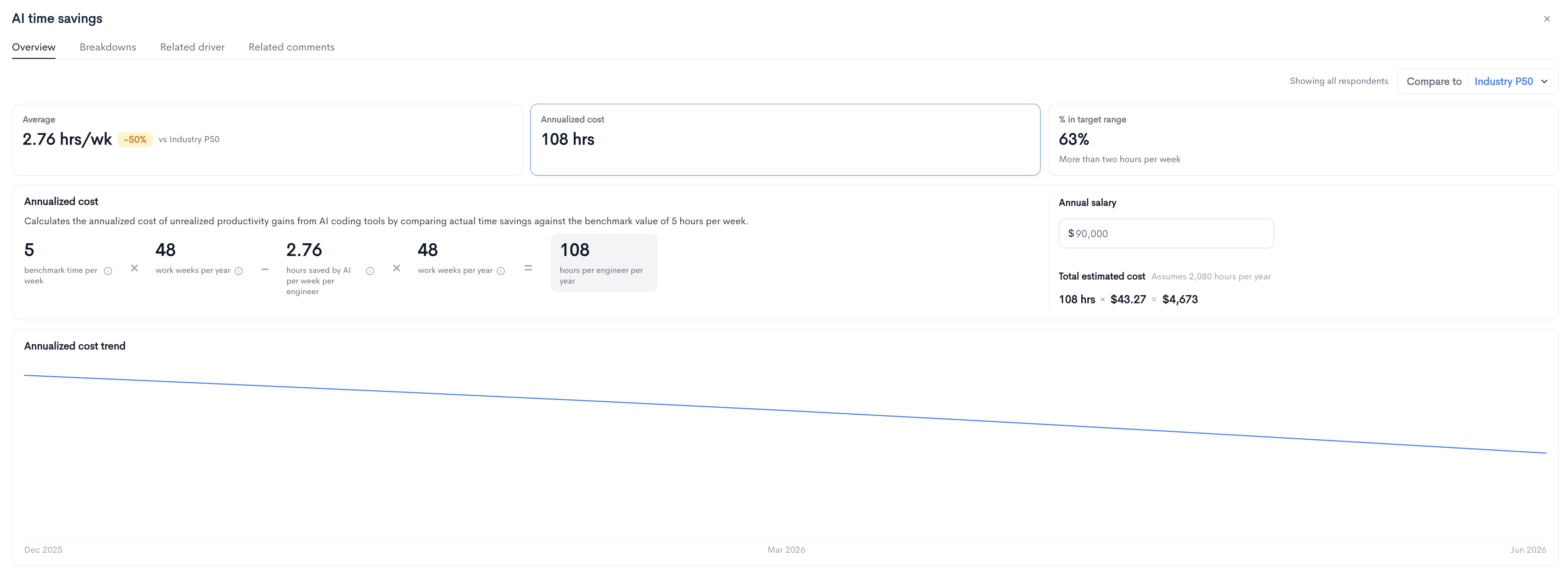
Selecting the Annualized cost card displays the calculation used to estimate the cost of this workflow.
The calculation compares the actual reported value against a benchmark value to derive the hours lost per engineer per year. Each input in the formula has an information tooltip explaining its source:
- Benchmark time per week - The reference value the actual result is measured against.
- Work weeks per year - The number of working weeks used in the calculation, set to
48. - Hours saved or lost per week per engineer - The average value reported by respondents.
- Hours per engineer per year - The resulting annualized figure.
The Annual salary field on the right converts the hours figure into a monetary estimate. Enter the average annual salary for your engineers and the total estimated cost is calculated using an assumption of 2,080 working hours per year.
The Annualized cost trend chart shows how the estimated cost has changed across previous snapshots.
Breakdowns
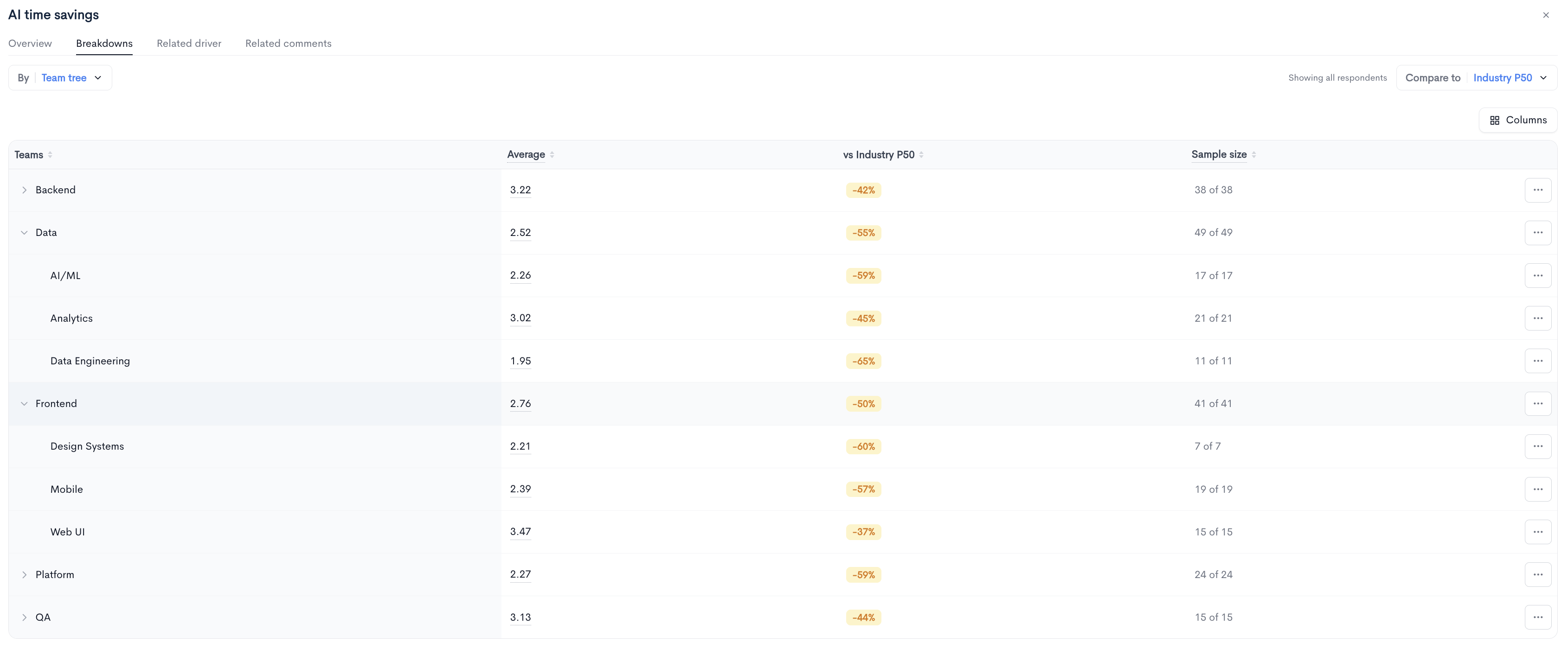
Shows the workflow value segmented by team. Use the By dropdown to change the grouping dimension and Columns to choose which columns are displayed.
The table contains the following columns:
- Teams - The team name, with expandable parent teams.
- Average - The average reported value for that team.
- vs Industry - The team's percentage difference from the selected benchmark.
- Sample size - The number of responses received out of the number surveyed.
Related driver
Displays the driver connected to this workflow, including the survey item, scoring method, sample size, score, and response distribution. Use the Score and Trends toggle to switch between current values and the average and distribution trend charts. Click View driver to open the full driver details.

Related comments
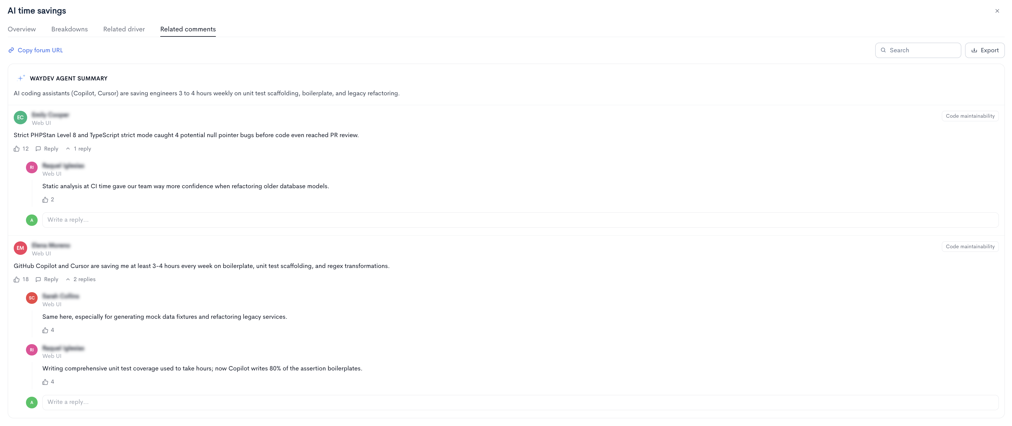
Lists all comments associated with this workflow, with Search and Export available at the top right.
Heatmap tab
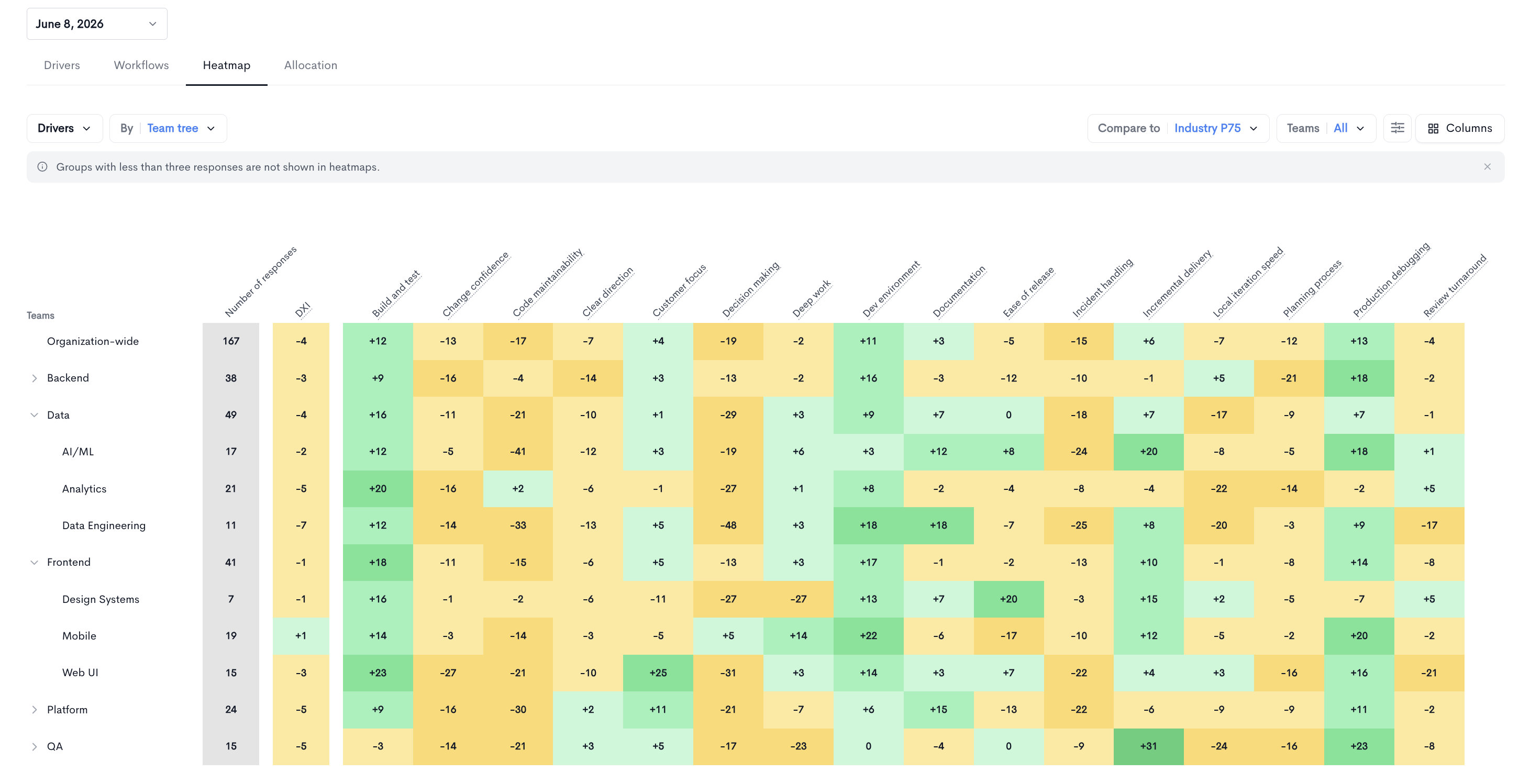
The Heatmap tab displays a grid of teams against metrics, with each cell colored by how far the value diverges from the selected benchmark. Green indicates performance above the benchmark and amber indicates performance below it.
The metric set displayed is controlled by the dropdown on the left, which offers the following options:
- Drivers - Driver scores for each team.
- Votes - Vote counts for each driver by team.
- Workflows (% in range) - The share of respondents within the recommended target for each workflow.
- Workflows (avg value) - The average reported value for each workflow.
The following controls are also available:
- By - Changes the row grouping dimension, for example
Team tree. - Filters - Opens additional filtering options for the grid.
- Columns - Selects which metric columns are displayed.
Rows begin with Organization-wide followed by each team. Parent teams can be expanded to reveal child teams. The first two columns show the Number of responses and the DXI for each row, followed by one column per metric.
Teams with no responses display a dash in every cell.
Allocation tab
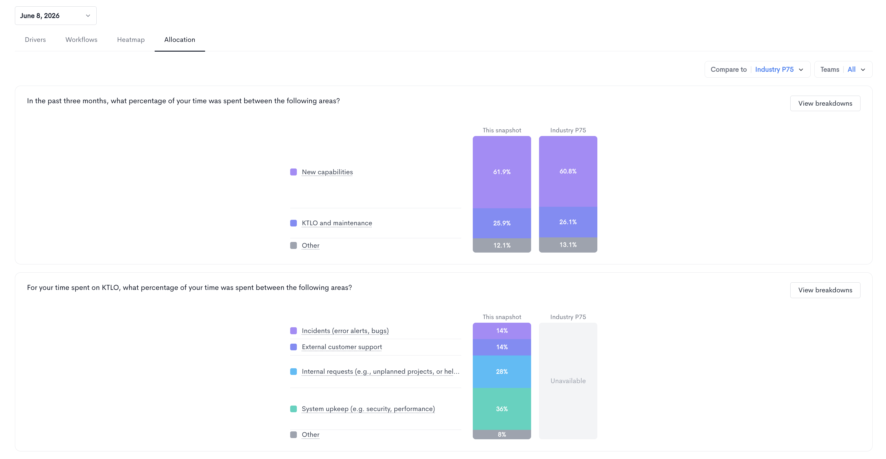
The Allocation tab shows how respondents reported splitting their time, based on the allocation questions included in the snapshot.
Each question is displayed in its own card with the question text, a legend listing every category, and two stacked bars comparing This snapshot against the selected benchmark. Each segment is labelled with its percentage.
Click View breakdowns on any card to see the same allocation split by team.
Allocation questions can be nested, so a follow-up question may ask respondents to break down one of the categories from a previous question in more detail.
Updated 25 days ago